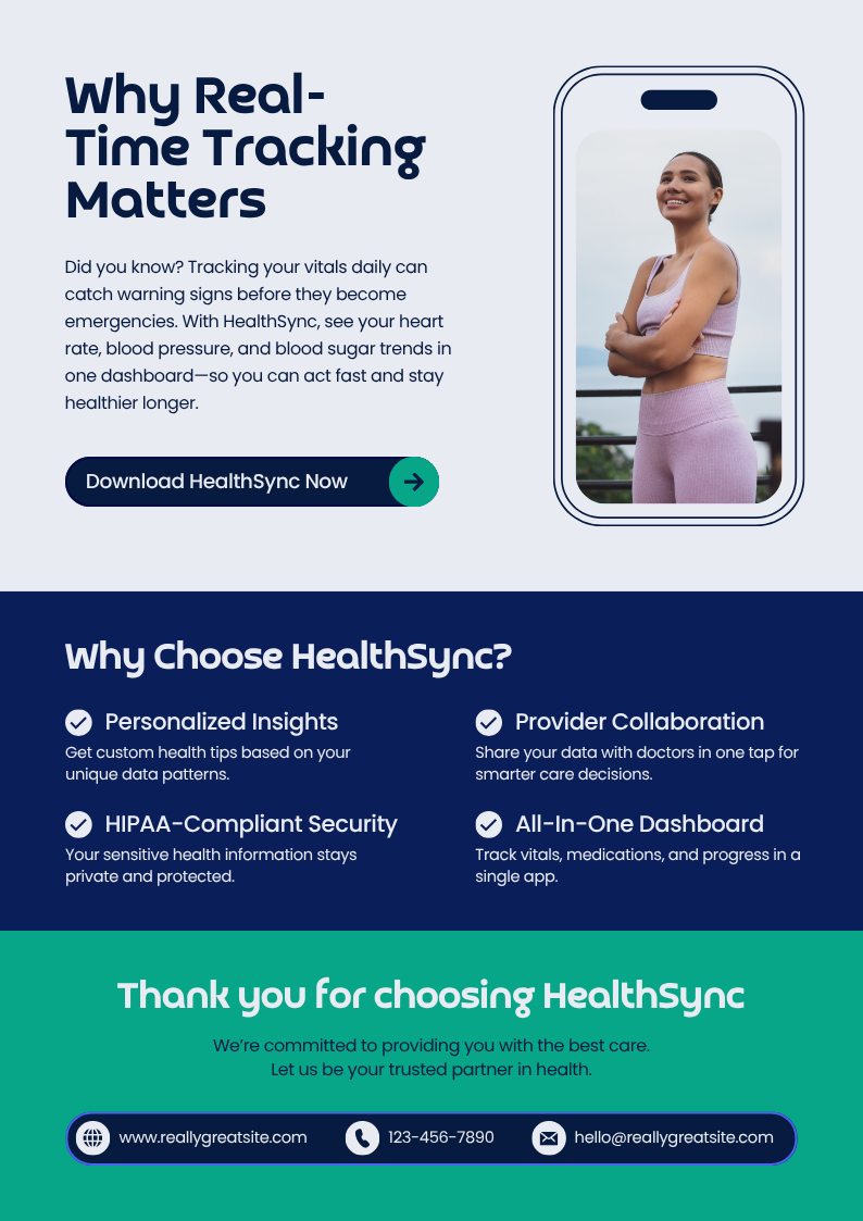
Whatever your focus, the way you design your digital presence can transform the outcome.
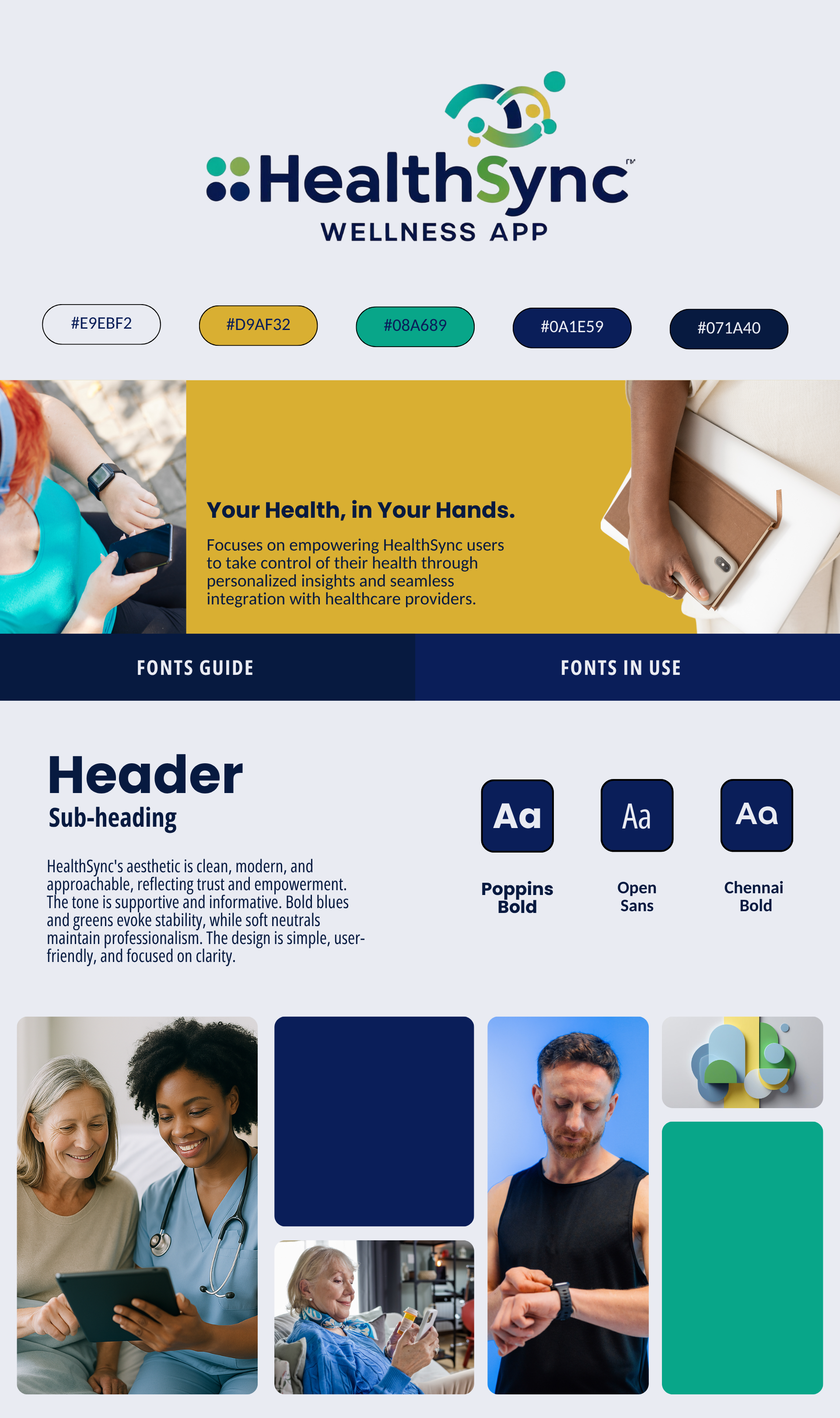
This wellness concept required a brand identity that communicated calm, trust, and gentle motivation. Instead of building a tech-forward interface driven by metrics, I shaped a user experience grounded in emotional reassurance and intuitive interaction.
-
The Challenge
Users needed to feel safe, seen, and personally supported. The wellness landscape is flooded with tools that feel clinical or hyper-performance-driven — the challenge here was to create something that feels nurturing, human, and quietly encouraging.
-
The Approach
I designed the tone and visual framework around serenity and reassurance. Colors were intentionally soft, typography modern yet unobtrusive, and user language was crafted with emotional sensitivity. Every interaction was shaped to make the user feel guided rather than assessed.
-
The Solution
The final concept blends a soothing visual identity with a conversational and empowering voice. Each touchpoint reinforces ease, caring, and belonging — fostering a deeper emotional connection. The experience invites the user to engage consistently, not out of obligation, but out of genuine comfort and motivation.
-
Outcome
The Wellness App concept now stands as a model of emotional-first design — prioritizing warmth over pressure, clarity over clutter, and connection over performance. It shows how branding can shape not just perception, but behavior, loyalty, and trust.